Copper Summit Website
Client: Copper Summit
Problem
Copper Summit did not have an official website to present the ski resort, its amenities, or its brand identity. Without a digital presence, potential visitors lacked a clear way to explore offerings, understand the resort’s positioning, or engage with the brand before arrival.
Solution
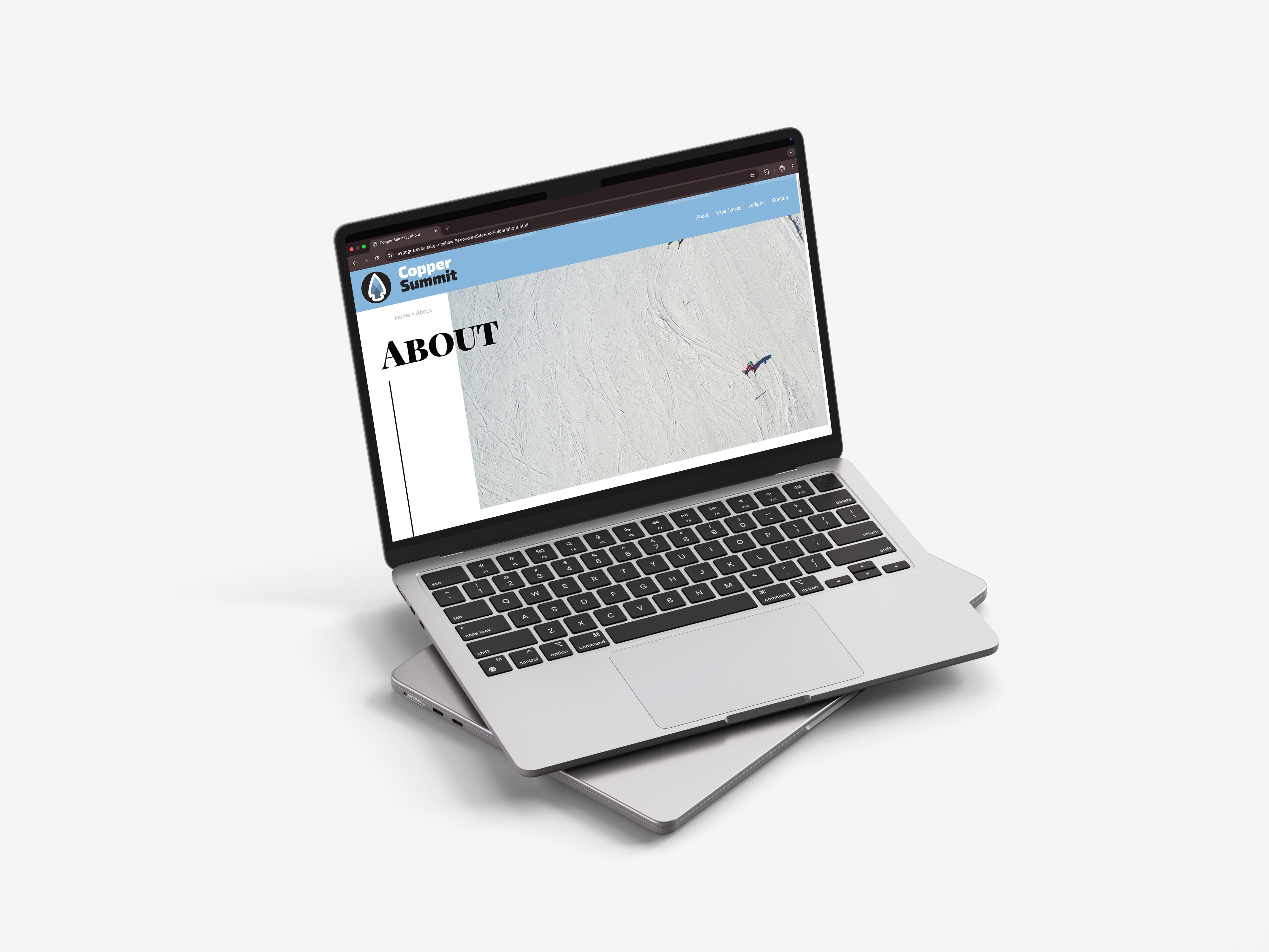
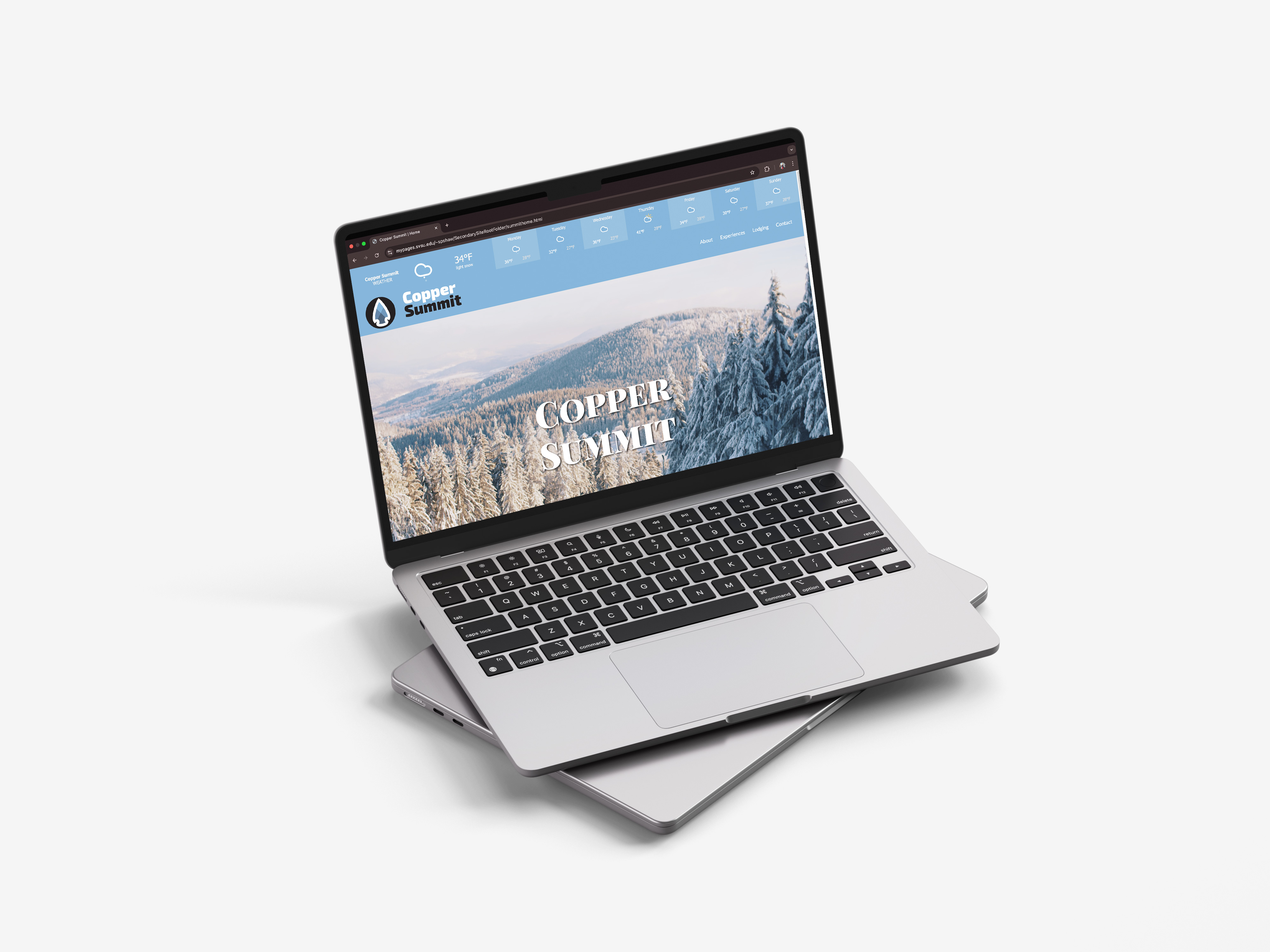
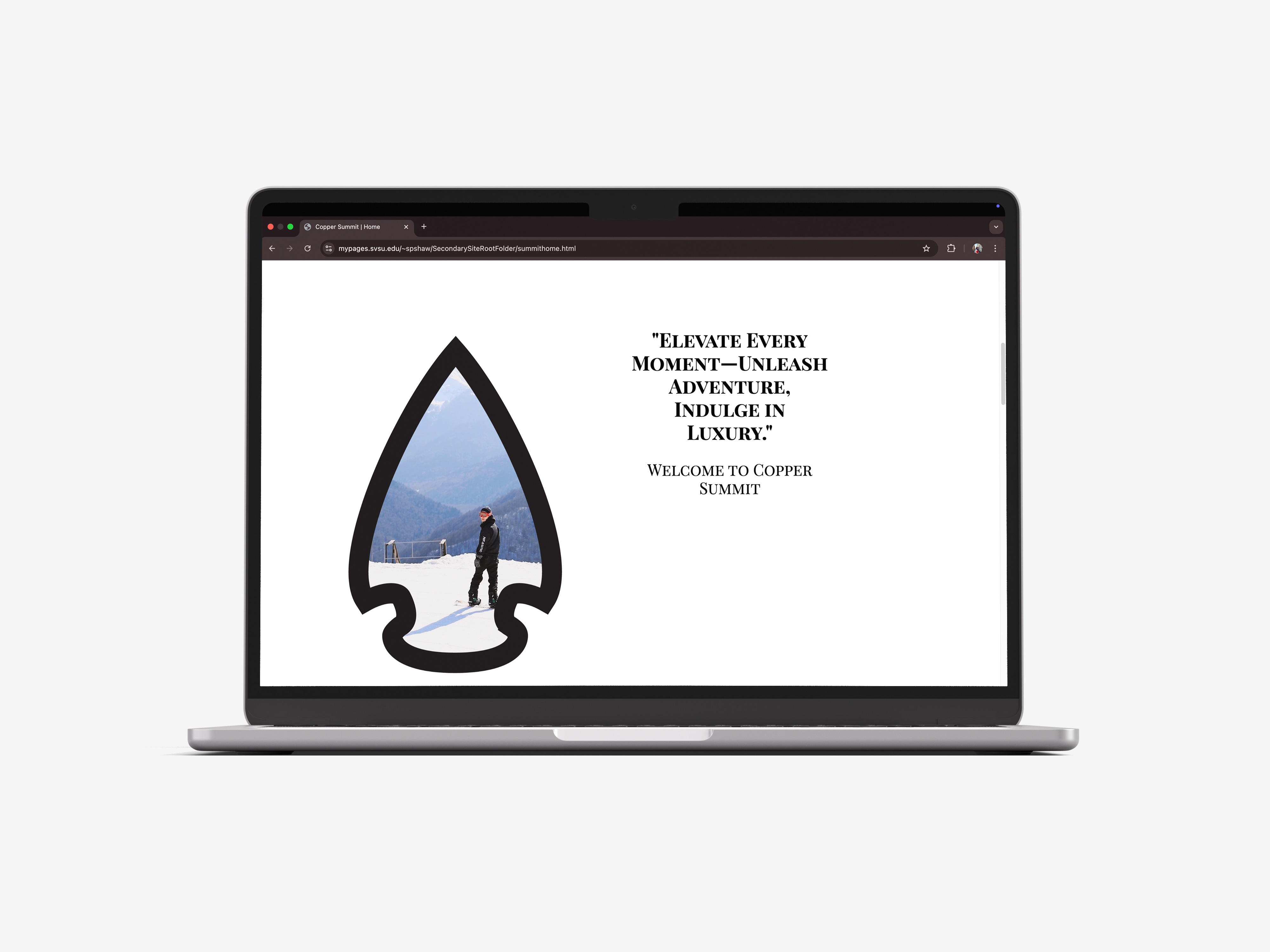
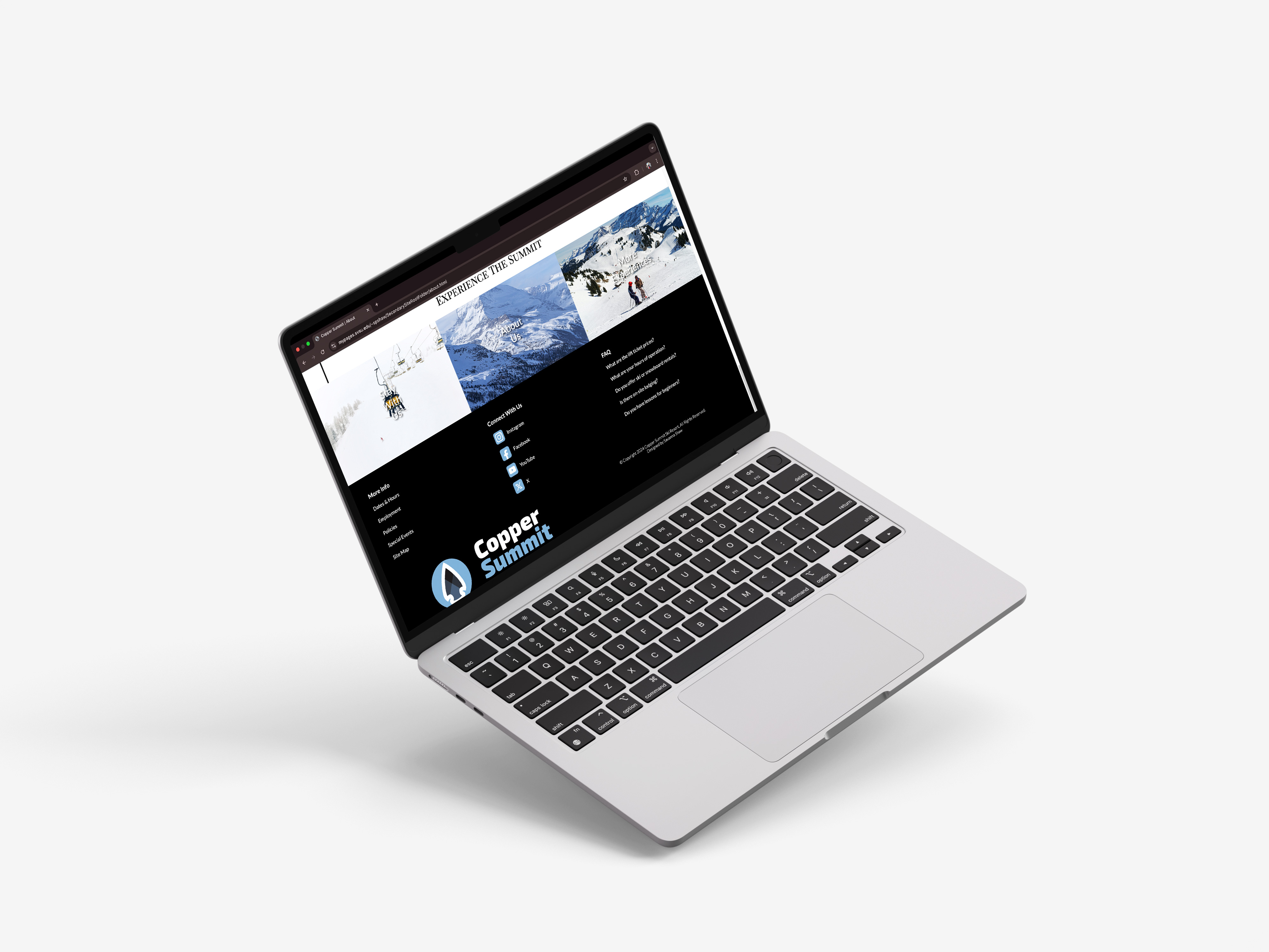
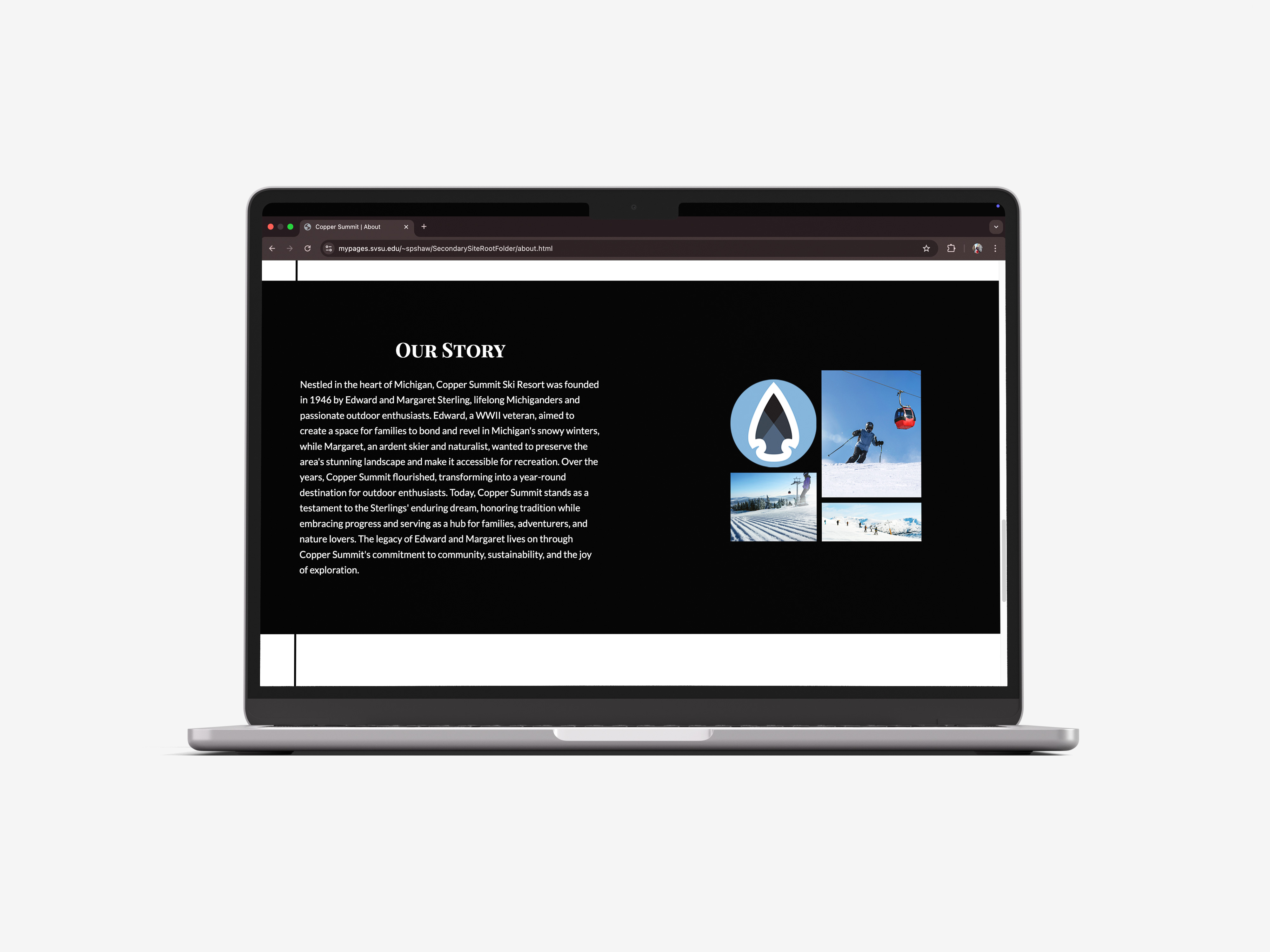
The website was designed to establish a strong and cohesive brand presence while prioritizing clarity and usability. Inspired by the Aspen Snowmass website, the interface incorporates Copper Summit’s copper head logo icon throughout the layout to reinforce brand identity. A light blue and black color palette was selected to convey clarity, simplicity, and a premium feel. Interactive elements, including a live weather widget, custom hover effects, and looping video banners on the homepage, were used to immerse users in the mountain experience. The navigation system was structured for ease of use, featuring a logo-based home button, clearly defined content sections, and a footer with custom-styled social icons and secondary links.