Peregrine Catalog
Client: Peregrine Snowboards
Problem
Peregrine did not have a catalog to showcase its snowboard designs from multiple countries around the world. The brand needed a cohesive print piece that could present its international lineup while capturing the energy and culture of snowboarding.
Solution
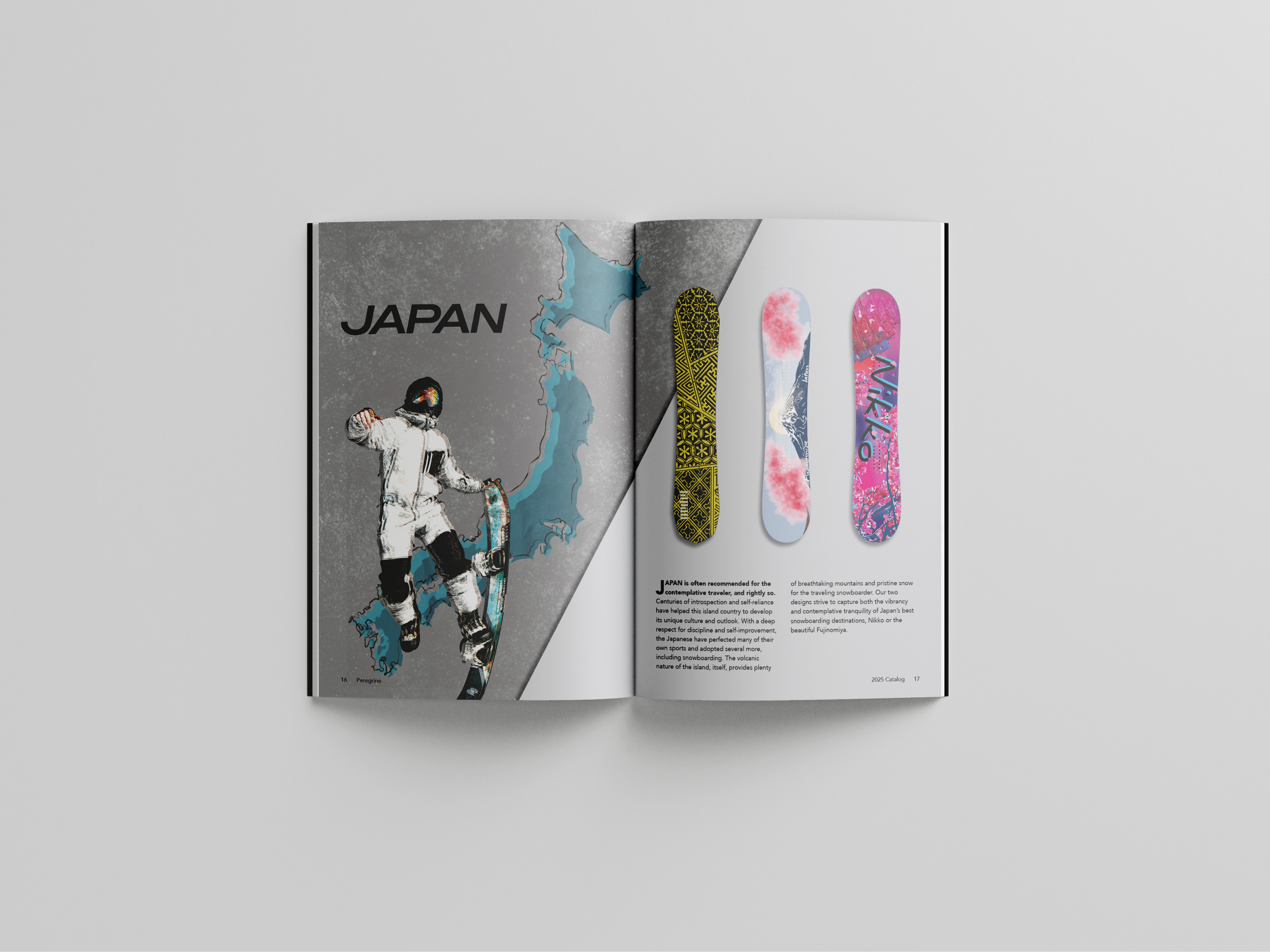
The catalog design was inspired by snowboarding's bold, movement-driven visual language and 1990s design influences. Dynamic layouts were created to emphasize motion and expression.
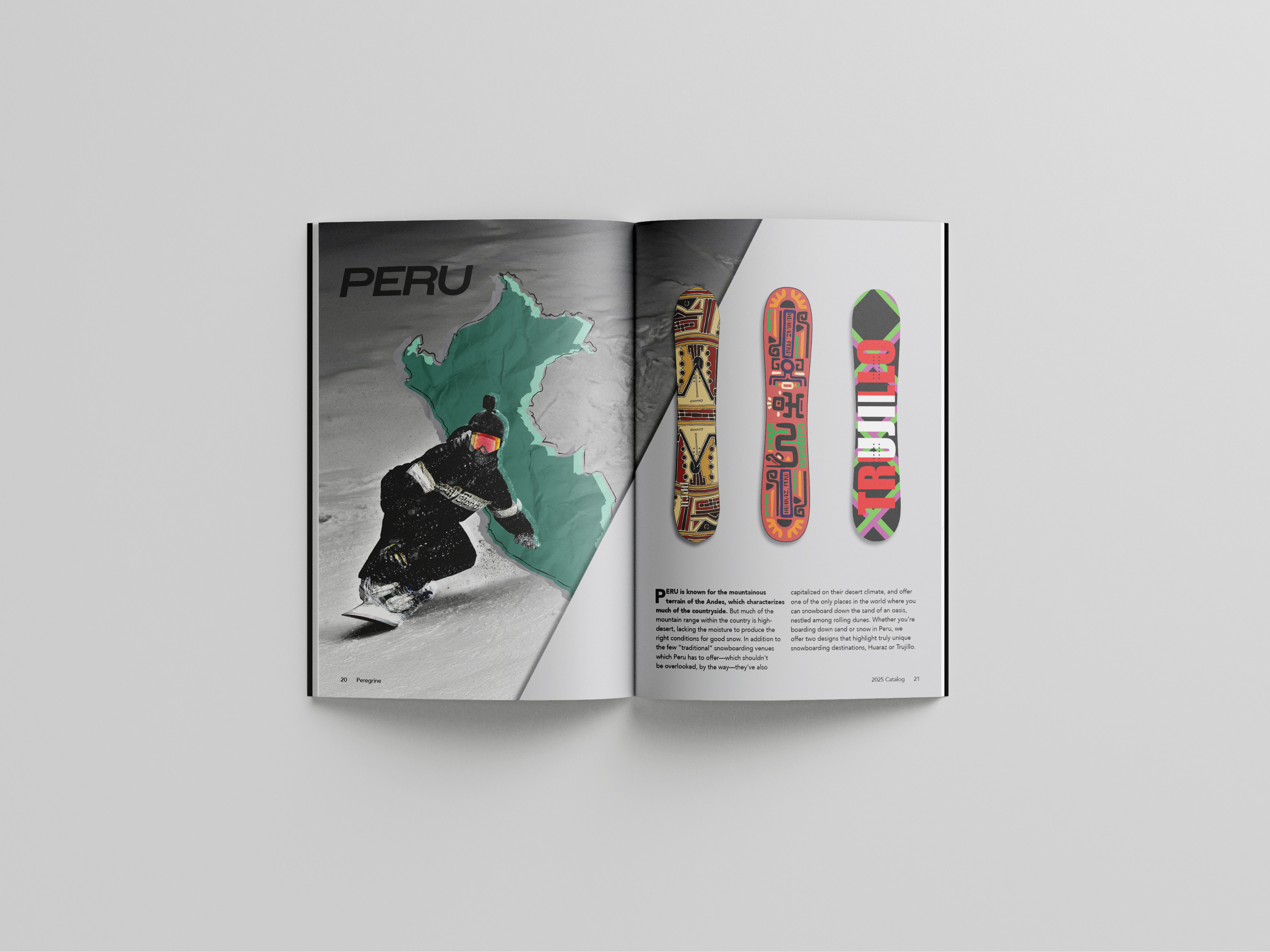
Imagery of snowboarders was combined with country maps using Photoshop blending modes,
with textured overlays added to create depth and visual complexity. A color palette of sea green,
blue, and orange was chosen to reference winter sports while maintaining strong contrast and
visual impact. The catalog was designed and assembled in Adobe InDesign, with visual
development completed in Photoshop.